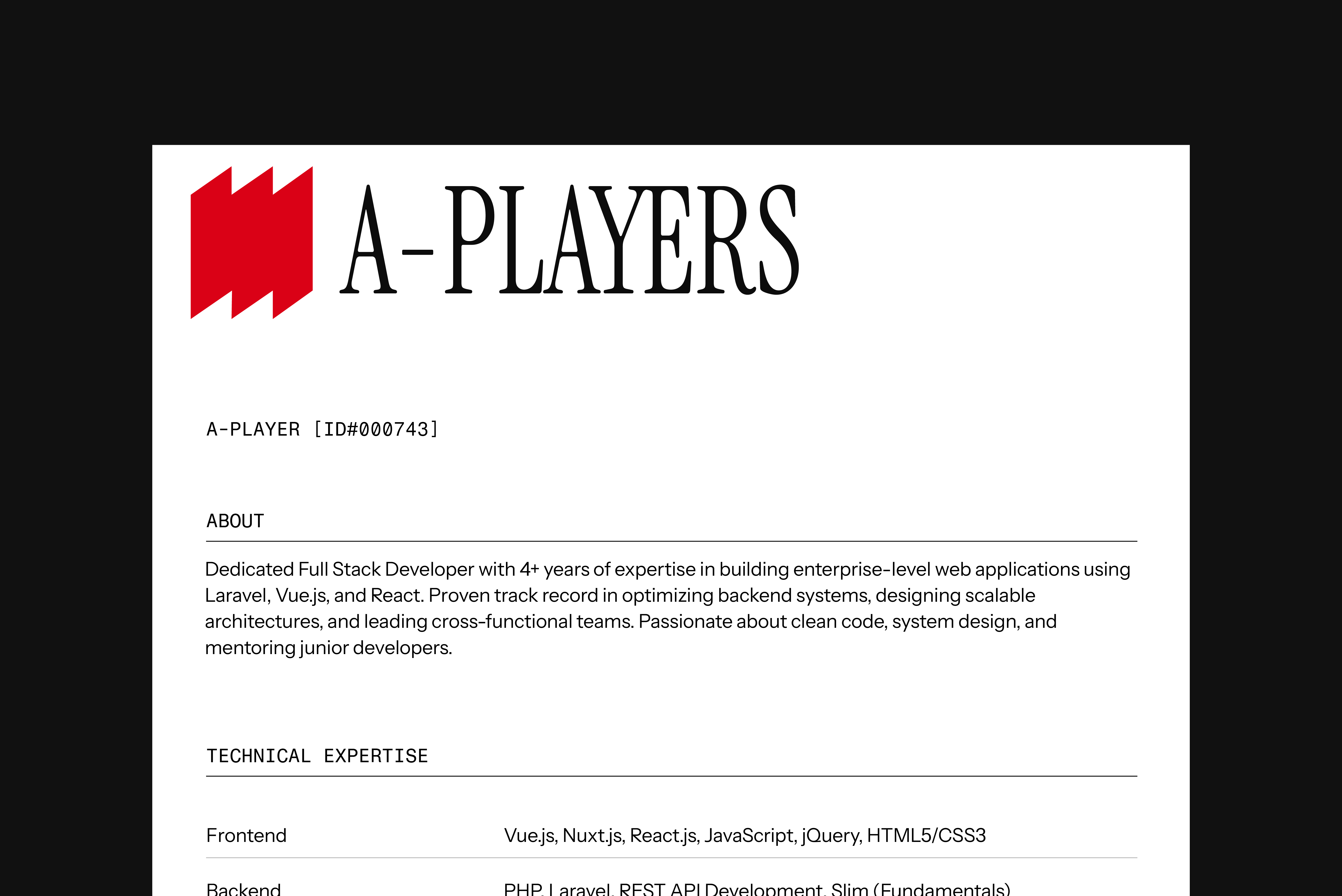
A-Players is a talent marketplace connecting South Asia's elite professionals with global teams. Handpicked and vetted by founders, their network spans tech, design, product, finance, media and beyond. Every candidate reflects the top 1% in their field— ready to jump in and make an impact.
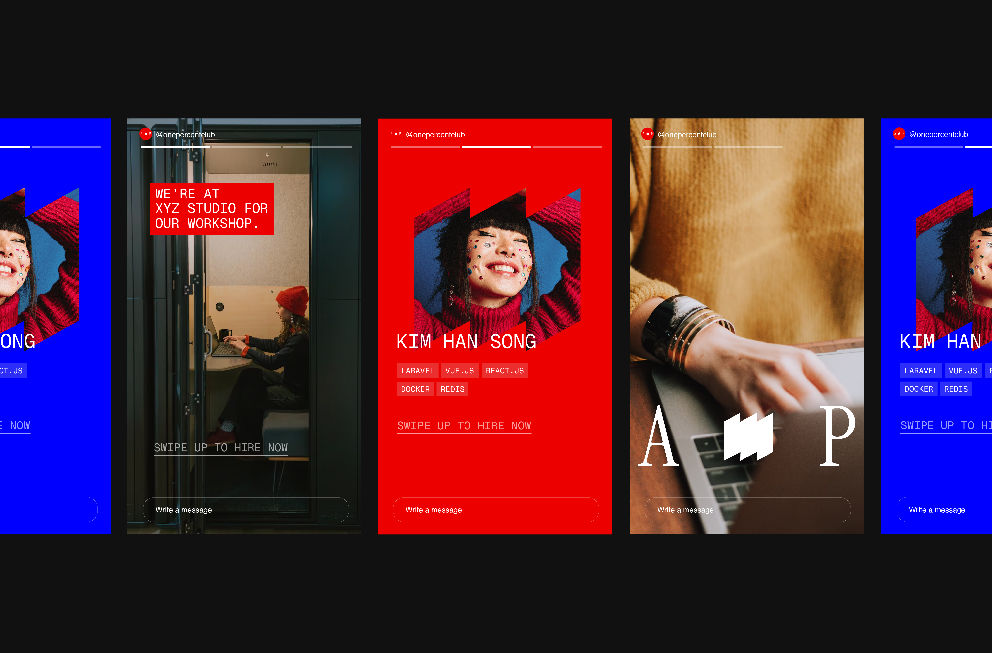
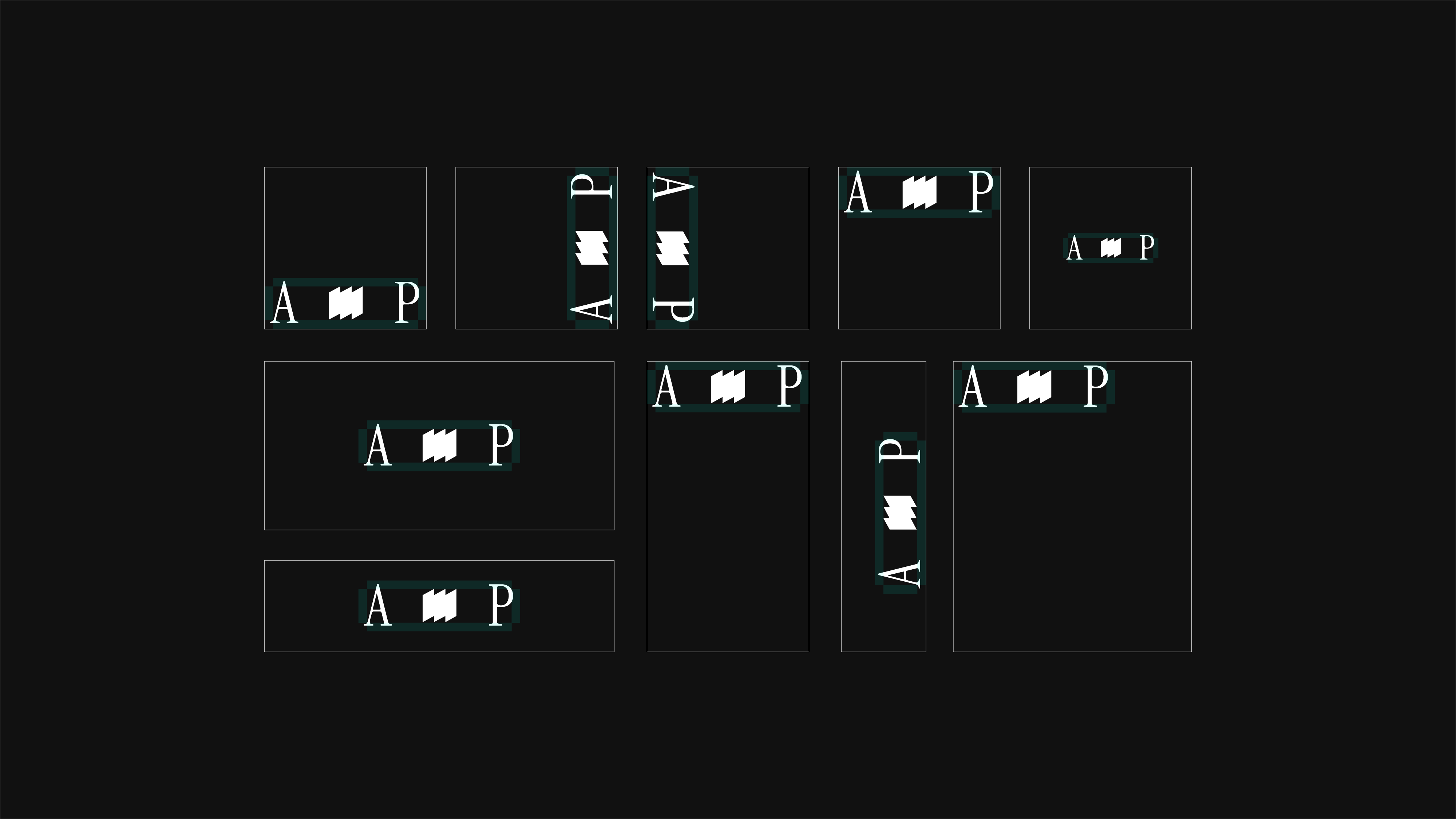
The branding centers around the three-card motif seen in the logo and all across the graphic implementations. Employers need to hire with speed and surety: The ideogram aims to take the place of the check mark, the definitive symbol signaling the highest value to the ones in search.
Deuteragonistic to the motif are the individuals. A-Players' focus on quality as opposed to quantity is reflected in the importance placed on the talents individually. The function of the company is not to provide a nameless disembodied pool of talent- but real people, stars, only the aces and not just any card in the deck. Brand imagery accordingly puts the the persons on full display, odes to their individuality and personality.