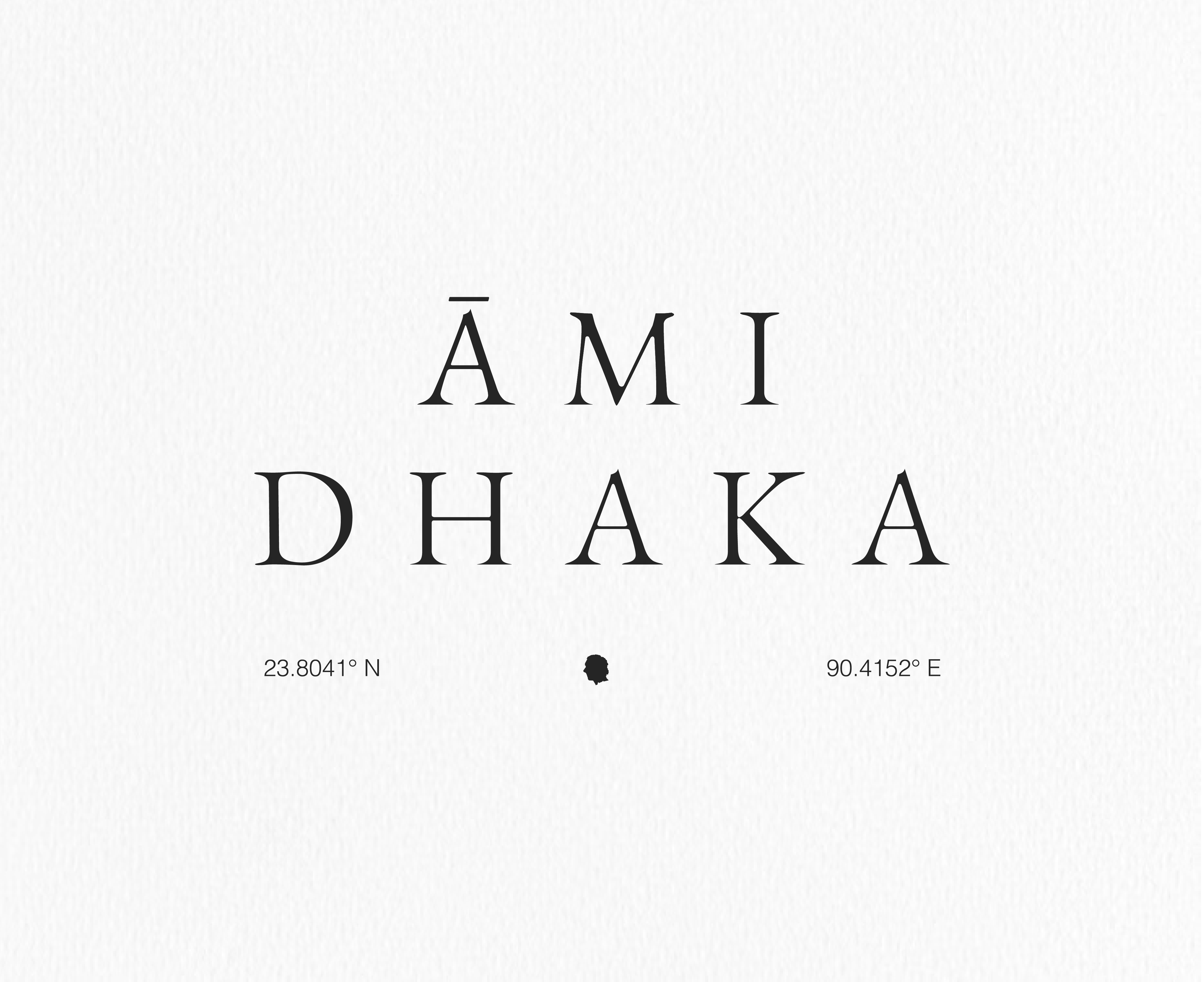
Projects/ Ami Dhaka
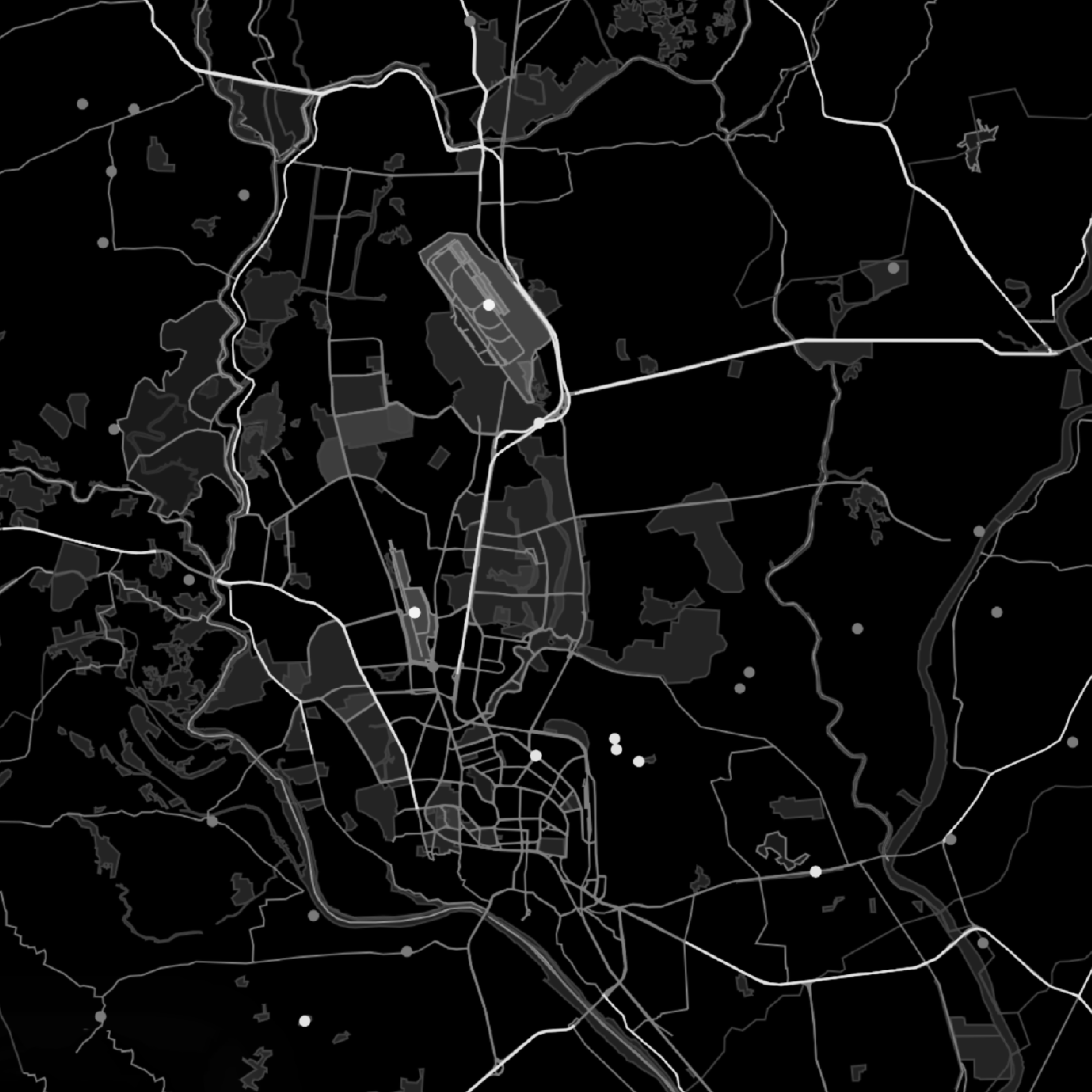
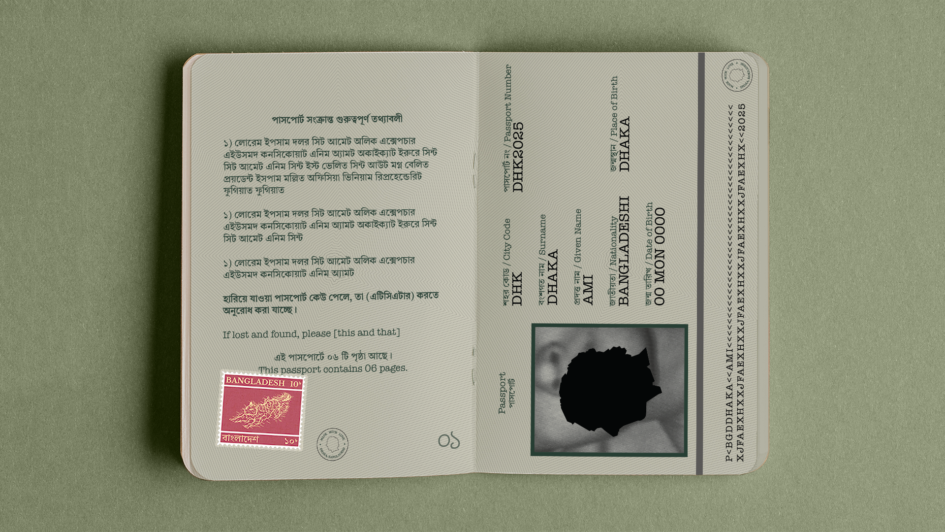
The Dhaka map takes the form of a face in profile view, which the motif derives from. It's the city, personified.


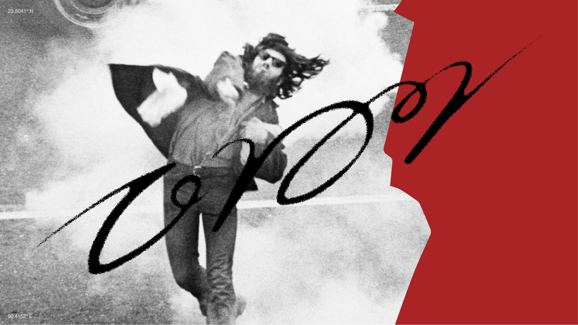
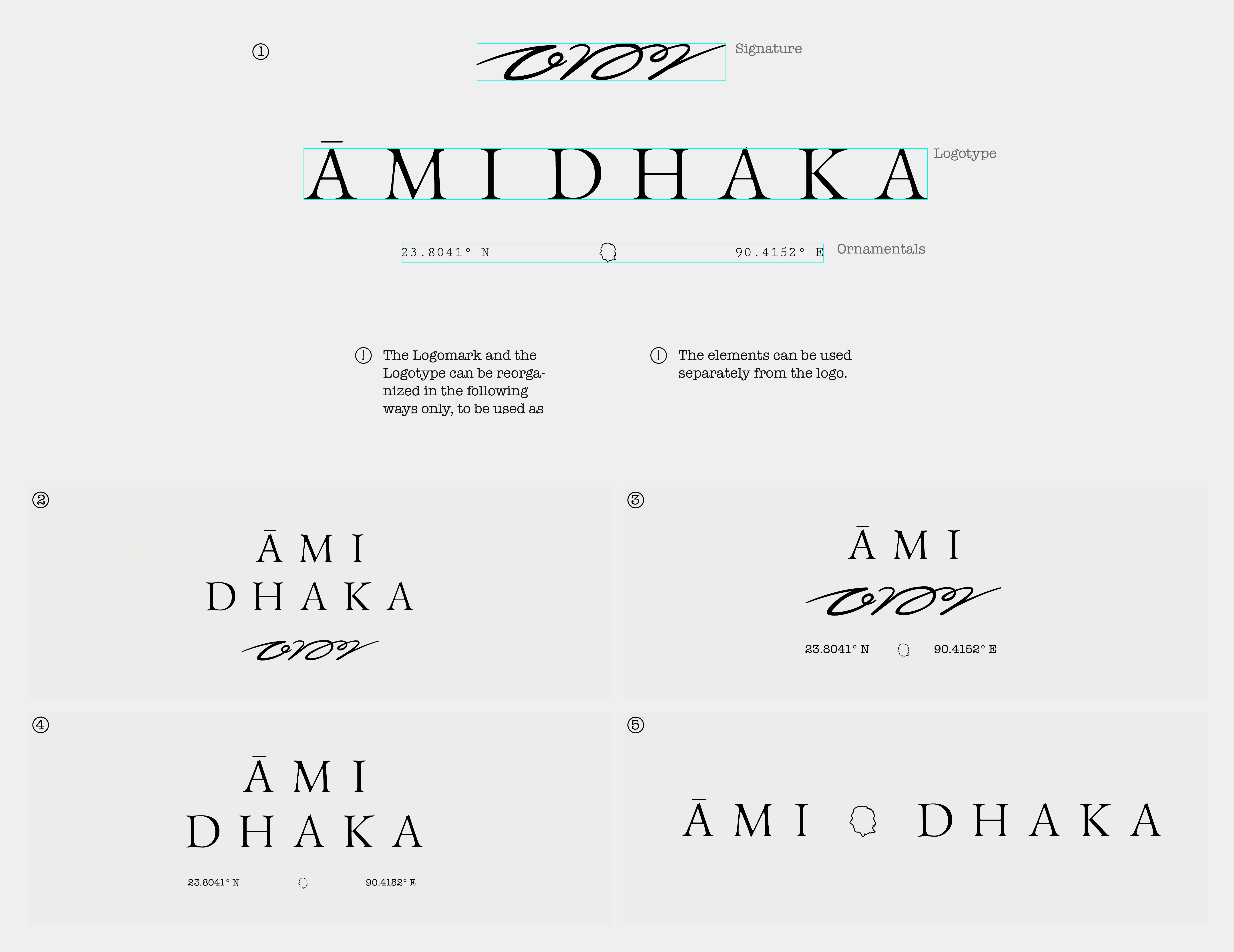
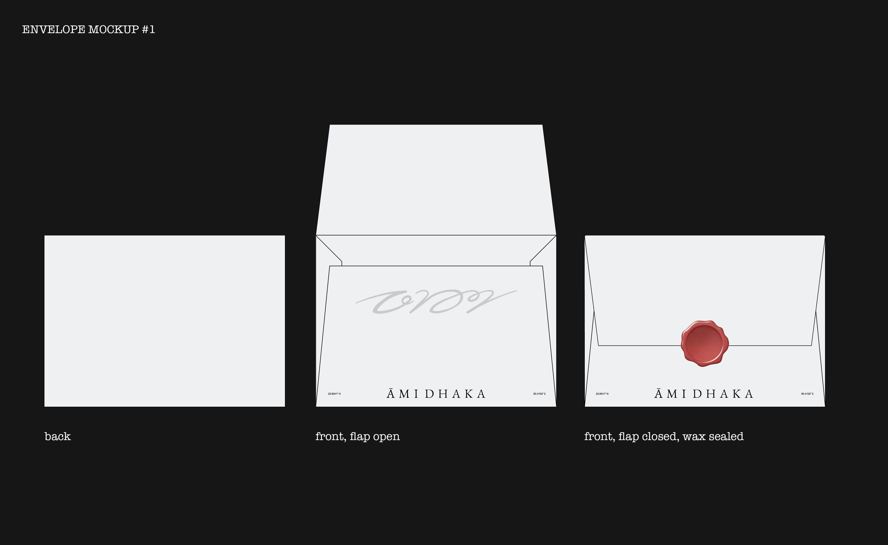
Both the symbol and the signature took an evolutionary route to ending up as their final form.
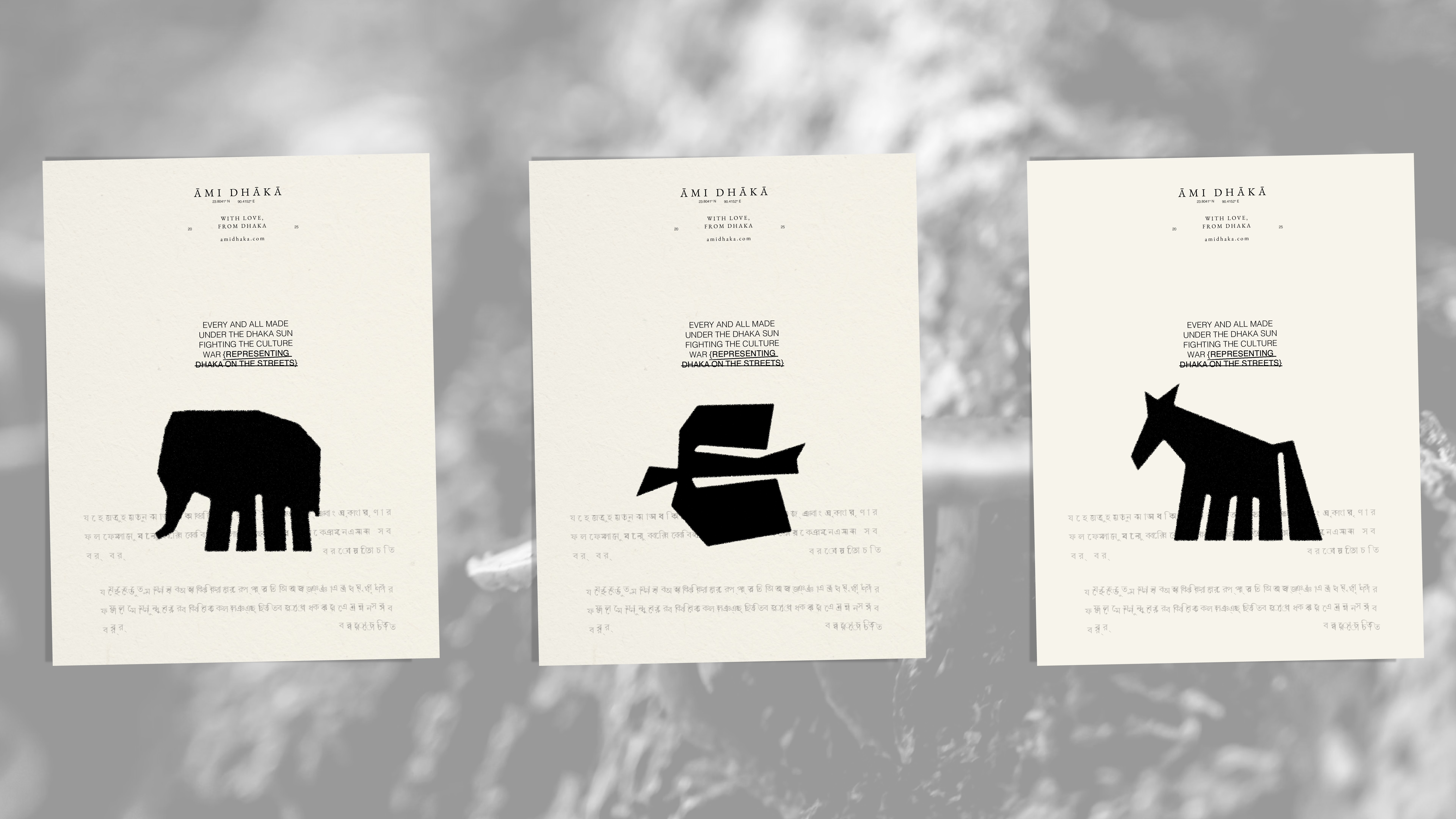
The brand itself is a love letter to Dhaka, bringing in different elements of premodern Bengali culture such as block printing, integrated here into graphics.
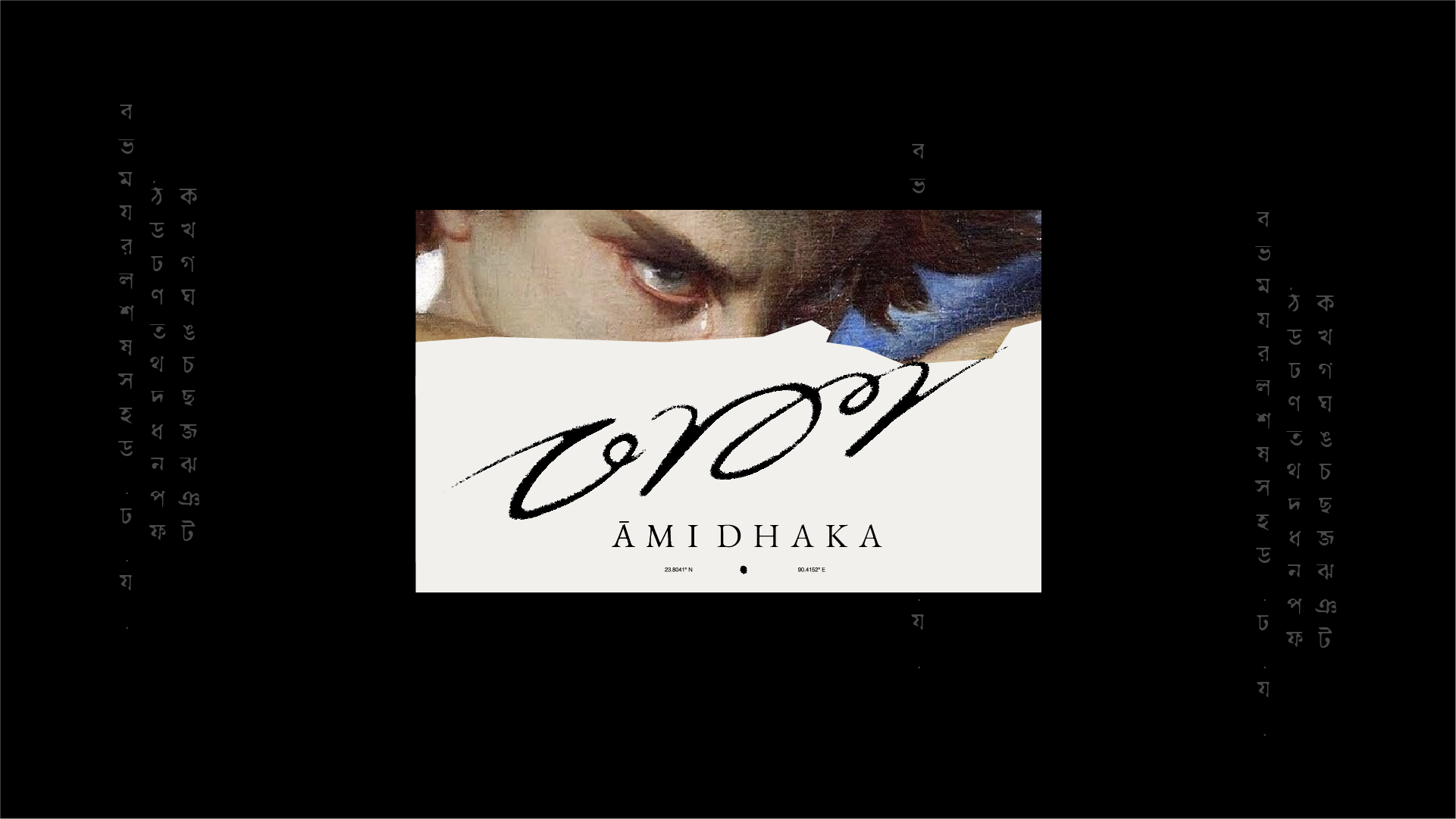
Zoomed-in subsection of the map edges are used all throughout graphic applications as container borders– again, subtle yet present.
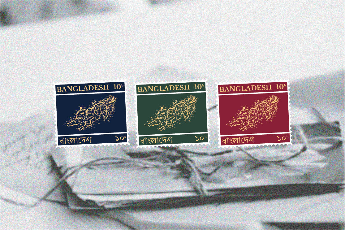
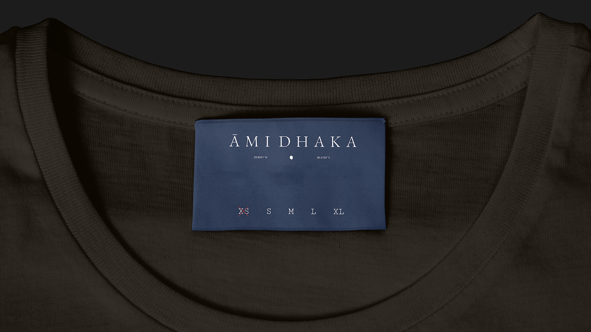
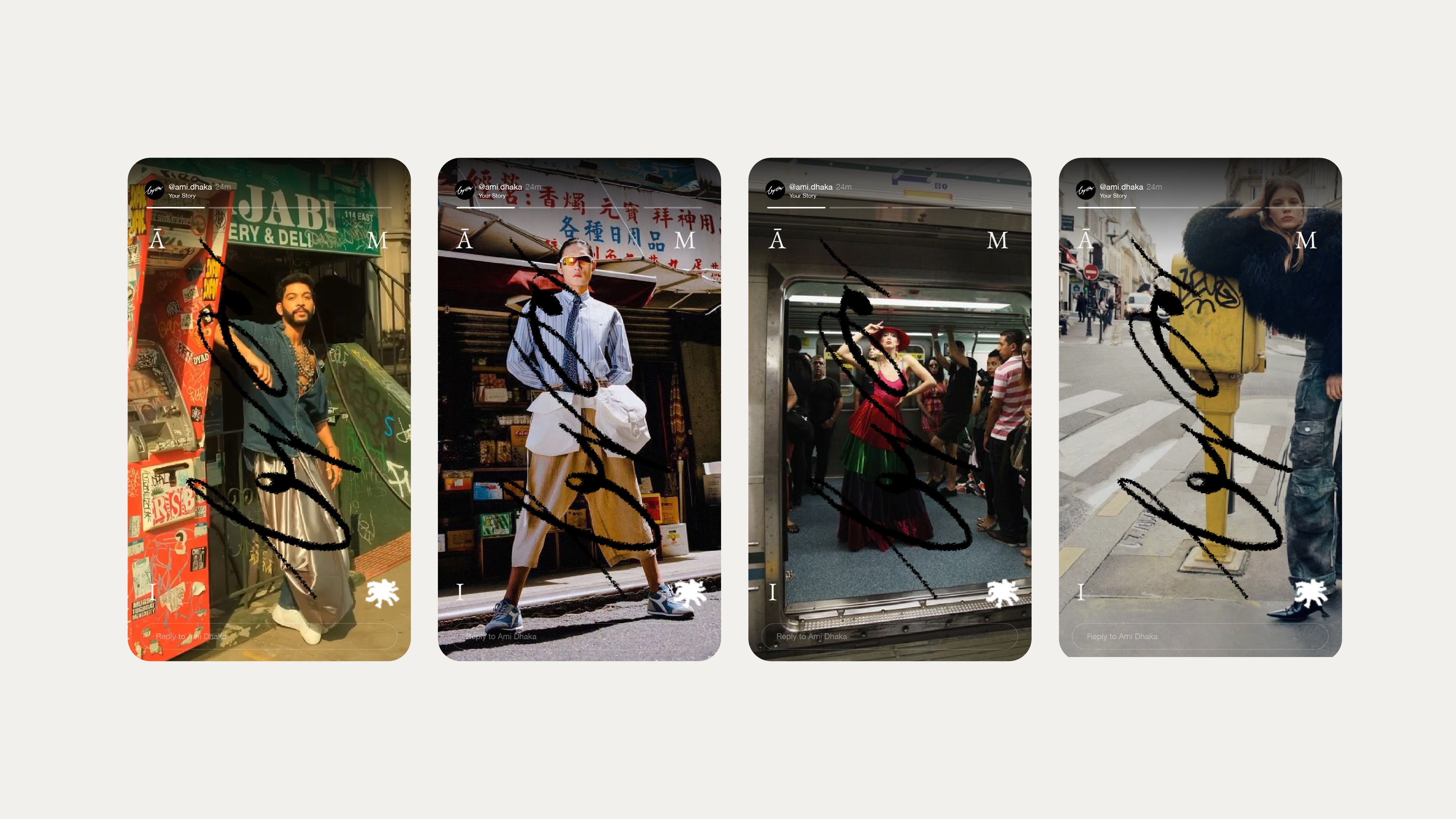
The team also developed functional souvenirs for the launch campaigns making the consumers that anthropomorphizes the brand.